For someone
Begin with a person, a shared memory or a moment worth keeping.

Brand guidelines · English
Make a little wish.
Finish it with your own hands.

Sandwish.art brings together imagination, color and the care of making something for someone. Choose a cover, remix it or create your own. Then turn the design into a real sand-art greeting card, by hand.
Begin with a person, a shared memory or a moment worth keeping.
Use a template or create a new cover. Let the inside pages carry your own words, names and dates.
The sender fills the card with sand before giving it. That care becomes part of the gift.
Small sand, Big wish
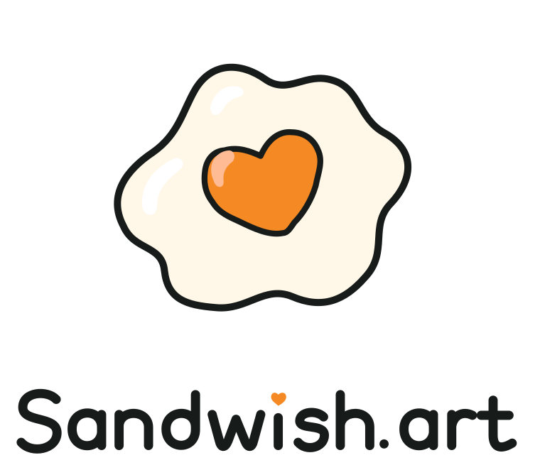
The naturally irregular egg white and warm orange heart-shaped yolk express a friendly, playful kind of care. The wordmark is a separate drawing, with rounded shapes and a small orange heart above the i.

Retain the soft, asymmetric edges, the natural tilt and the restrained highlights on both the white and the yolk.
Leave at least half a heart-yolk width clear around the logo. Use the standalone mark in narrow spaces.
Recommended minimums: 24 px for the mark and 180 px for the full logo. Keep proportions intact; do not stretch, add shadows or rotate the wordmark.
A small, consistent palette keeps the brand recognizable. The website gives the artwork room to shine. Customer designs can use their own palettes; brand colors never replace a chosen sand color.
#F58A24Heart-shaped yolk and signature accents.
#F6B82FPrimary actions and warm brand moments.
#171B19Type, outlines and dark backgrounds.
#FFFCF2Quiet backgrounds and open space.
#FFF7E7The soft white of our egg mark.
#D9E7EFOccasional supporting backgrounds.
Use Ink text on gold, white and cream backgrounds. Reserve functional colors for meaningful states. Sand swatches represent materials and remain separate from the brand palette.
The custom SVG wordmark is a graphic, not a substitute for ordinary text. Use Manrope for English interface copy and numbers. The handwritten slogan adds a personal accent; long messages need comfortable spacing and clear letterforms.
Manrope · Aa Bb Cc · 0123456789
Closed color shapes, soft curves and a few simple lines connect the visual identity to filling a card with sand. The yellow, white and orange egg pattern is a supporting brand asset for wrapping, liners, thank-you notes and selected website backgrounds.
Crop the pattern to suit its surface, preserving the original color relationships. Leave a clear area behind text. Keep the editing canvas quiet and the heart-yolk mark as the main identifier.
Keep cover drawings flat and clearly divided. Use real material photographs to show sand texture and glitter. Color references remain provisional until checked against physical samples.
Be warm, direct and specific. Help people make choices while leaving the personal message to them. Explain progress clearly, preserve their work and offer a useful next step.
“Who is your card for?”
“Keep this composition and try a winter palette.”
“Your cover is ready. Let’s make it yours inside.”
Browse templates before entering DIY. Keep tools restrained, artwork prominent and material choices clear. Honor reduced-motion preferences.
Use open space, warm gold and a modest logo on packaging. The back of the card is the fixed brand area. Cover sharing never includes private inside pages.
These SVG assets scale cleanly and preserve the approved shapes. Always use the supplied artwork rather than redrawing or typing the wordmark.